R3 GUI Panels and Layouts
Technical documentation for developers.
Part of the R3 Graphical User Interface (GUI).
New users should read the R3 GUI - User's Guide.
Concepts
A panel is a layout of faces.
Panels are collections of related faces used for specific parts of a user interface. The faces within a panel are created during the layout stage of processing where the GUI language (a dialect) is interpreted and its styles create actual faces.
The GUI system has been designed to make panels very easy to create, debug, and maintain. One of the main goals was for simple GUI definitions to be able to create a wide range of simple, predictable results, but also to allow more sophisticated and elaborate results to be produced using the same set of basic rules.
Basically, panels provide a way to:
- Group a number of faces together,
- Arrange faces into a desired layout,
- Display a 2D layer, with background or other effects,
- Update and resize those faces when events occur.
Every window of the GUI display is a panel, and each contains a number of sub-panels to further divide its area into sections. And, a panel is itself a face, and a GUI is created from one or more layers of panels, each of which holds faces of its own.
The faces that compose a panel are defined using the GUI language, a special dialect of REBOL. This approach saves time and effort compared to function-based or tag-based languages.
Using Panels
Panels are fundamental to the GUI. When you open a new window like the one defined below, you are creating a panel.
Missing image: /-code
view [
    text "Example window."
    button "Close" close
]
Here the view function internally calls the make-panel function that takes the GUI dialect block and builds a panel object as a result. The panel contains two faces: one of the text style and one of the button style.
Panels are often used to divide other panels with subpanels:
Missing image: /-code
view [
    panel [
        text "Show website"
        button "Show" browse http://www.rebol.com
    ]
    panel [
        text "Example window."
        button "Close" close
    ]
]
This window panel contains two subpanels.
New panels can also be created directly with make-panel, and then dynamically added to other panels and displayed.
b-panel-gui: [
    text "Example window."
    button "Close" close
]
b-panel: make-panel 'group b-panel-gui none
switch b-panel a-panel 'fly-up
This code creates a new panel then switches to display it with the fly-up transition.
Panel Functions
The GUI functions that deal with panels are:
| Function | Description |
|---|---|
| view | Create a panel and display it in a window. |
| set-panel | Set panel input face values from a block of values. |
| get-panel | Get panel input face values as a block. |
| clear-panel | Clear panel input face values. |
| parse-panel | Parses the panel dialect and returns a block of faces/commands. |
| layout-panel | Layout a panel by setting faces sizes and offsets. |
| resize-panel | Resize a panel face, layout its subfaces, render it. |
| effect-panel | Display a panel transition effect. |
| switch-panel | Switch the contents of a panel, using the effect if specified. |
| get-parent-panel | Get panel input faces for the contextual parent panel. |
| get-panel-var | Get the value of a top level panel/names local variable. |
Panel Object is a Face
Panels just use the face object, with a few extra fields added:
| Field | Datatype | Description |
|---|---|---|
| grid | object! | Layout parameters and limits, mainly for sizing. |
| faces | block! | A list of the faces within the panel. |
| triggers | block! | Triggers used for the panel. |
These fields are used mainly by the GUI system, not by end-user code. Also, additional fields may be appended by special panel styles.
Panels for Layout
Panels provide an efficient and elegant mechanism for laying out the elements of a GUI.
A panel is defined as a collection of faces. When specified within the GUI dialect, the order of the style names determines their positions within the panel area.
For example, using the code below, you'll see the buttons positioned in that same order vertically:
Missing image: /-code
panel [
    button "First"
    button "Second"
    button "Third"
]
Panel Variations
As you can see above, the default layout direction is vertical. Faces are positioned from top to bottom. However, several variations in layout are possible, and a few predefined styles are available that can be used in various combinations to create a wide variety of layouts.
| Style | Description |
|---|---|
| panel | Provides a backdrop with a border around it and arranges its contents vertically by default. |
| group | Does not include a backdrop, and its contents are arranged horizontally by default, and, a group has no margin. |
| tight | Is a group that has both margin and spacer set to zero. |
The examples below show the main differences between the panel and group styles.
Here's a panel layout. It's default orientation is vertical and it has a border:
Missing image: /-code
view [
    panel [
        button "First"
        button "Second"
    ]
]
And, here's a group layout. It's default orientation is horizontal, and it has no border:
Missing image: /-code
view [
    group [
        button "First"
        button "Second"
    ]
]
And this is a tight layout. It's also horizontal by default, but with minimal spacing between elements:
Missing image: /-code
view [
    tight [
        button "First"
        button "Second"
    ]
]
This table summarizes the main differences between these panel styles:
| Style | Direction | Backdrop | Border | Spacing |
|---|---|---|---|---|
| panel | vertical | yes | yes | normal |
| group | horizontal | no | no | normal |
| tight | horizontal | no | no | none |
Multiple Columns
You can specify the number of columns for a panel or group styles. This is convenient for many layouts, such as input forms that contain multiple labels and input fields.
Here's an example two column panel:
Missing image: /-code
view [
    panel 2 [
        button "First"
        button "Second"
        button "Third"
        button "Fourth"
        button "Fifth"
        button "Sixth"
    ]
]
The buttons are laid out in columns first, then rows. The number of rows is simply determined by dividing the total number of faces by the number of columns.
Note that columns work for group panels too:
Missing image: /-code
view [
    group 2 [
        button "First"
        button "Second"
        button "Third"
        button "Fourth"
        button "Fifth"
        button "Sixth"
    ]
]
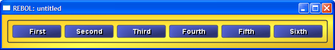
Continuing on, here is a three column panel layout:
Missing image: /-code
view [
    panel 3 [
        button "First"
        button "Second"
        button "Third"
        button "Fourth"
        button "Fifth"
        button "Sixth"
    ]
]
And if we show four columns, note that we don't have enough buttons. In such cases, the remaining cells are padded with blanks.
Missing image: /-code
view [
    panel 4 [
        button "First"
        button "Second"
        button "Third"
        button "Fourth"
        button "Fifth"
        button "Sixth"
    ]
]
Horizontal Only
If you need a strictly horizontal layout a special value of zero is used. This is a similar layout to a group panel, but includes the border and background.
view [
    panel 0 [
        button "First"
        button "Second"
        button "Third"
        button "Fourth"
        button "Fifth"
        button "Sixth"
    ]
]
The zero indicates a single row using as many columns as necessary.
Note that you don't need this for group panels, because horizontal layout is their default.
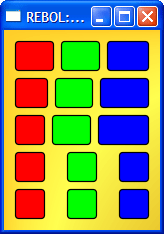
Combining Panels
To create a wide variety of layouts, you can combine panel and group styles in various ways.
For example, here's a group of panels of buttons:
Missing image: /-code
view [
    group [
        panel [
            button "First"
            button "Second"
        ]
        panel [
            button "Third"
            button "Fourth"
        ]
        panel [
            button "Fifth"
            button "Sixth"
        ]
    ]
]
But, here they are stacked in a different order:
Missing image: /-code
view [
    group 1 [
        panel 2 [
            button "First"
            button "Second"
        ]
        panel 2 [
            button "Third"
            button "Fourth"
        ]
        panel 2 [
            button "Fifth"
            button "Sixth"
        ]
    ]
]
The example below shows how different numbers of elements can be grouped on separate rows:
Missing image: /-code
view [
    group [
        button "First"
        button "Second"
    ]
    group [
        button "Third"
        button "Fourth"
        button "Fifth"
    ]
    group [
        button "Sixth"
        button "Seventh"
        button "Eighth"
        button "Nineth"
    ]
]
Input Form Panel
Of course, the above layouts are just for illustration. A real panel might look more like:
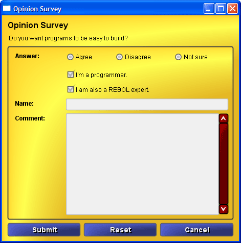
Opinion survey form (alpha skin)
And, it's code is:
view [
    title "Opinion Survey"
    text "Do you want programs to be easy to build?"
    panel 2 [
        label "Answer:"
        group [
            radio "Agree"
            radio "Disagree"
            radio "Not sure"
        ]
        pad
        check "I'm a programmer."
        pad
        check "I am also a REBOL expert."
        label "Name:"
        field
        label "Comment:"
        area
        pad ; temporary, for bug
    ]
    group [
        button "Submit" submit http://www.rebol.net/cgi/submit.r
        button "Reset"  reset
        button "Cancel" close
    ]
]
For more examples, see R3 GUI - User's Guide.
Panel Spacing
The panel style defines the spacing for its layout. The spacing consists of a margin at the panel's edges and the spacer size between each face that it contains.
Missing image: /get
Margins and Spacers
The margin and spacer are style options and can be specified in the options block. Both values are pairs, so they can define both horizontal and vertical spacing in pixels.
Here are a few panels with specified options:
Missing image: /-code
view [
    panel [
        button "1"
        button "2"
        button "3"
    ]

    panel [
        button "1"
        button "2"
        button "3"
    ] options [margin: 30x30]

    panel [
        button "1"
        button "2"
        button "3"
    ] options [
        margin: 30x30
        spacer: 20x20
    ]
]
Also, keep in mind that a group style defines its margin as 0x0 and a tight style defines both its margin and its spacer as 0x0.
Extra Pad Spacing
From time to time you may need additional spacing between faces in a panel. The pad style has been defined to help with this.
The pad style can be used with or without optional size information. When used alone, it expands space automatically. Or, you can give it an exact size.
Here are a few examples:
Missing image: /-code
view [
    panel [
        button "1"
        button "2"
        button "3"
    ]

    panel [
        button "1"
        pad
        button "2"
        button "3"
    ]

    panel [
        button "1"
        pad 10x20
        button "2"
        button "3"
    ]
]
Note that a pad spacer is an actual face, so when used with columns, it will count as the element of a cell.
Missing image: /-code
view [
    panel 2 [
        button "1"
        button "2"
        pad
        button "3"
    ]
]
Panel Sizing
The size of a panel is determined by its elements and by the size available for it (for example, by the size of the screen or window). And, within a panel, the rows and columns that make up its layout may be of different widths and heights.
In general the rules are:
- The widest element of a column will set the column width.
- The tallest element of a row will set the row height.
- Columns and rows can be smaller or larger than these values, depending on the availability of space for expansion.
Size, Min-size, Max-size
More specifically, the sizes of elements are determined by their sizes, as set by their styles or by their face instance. Each style, hence each face, can specify three sizes:
| Facet | Description |
|---|---|
| size | called the natural size of the face, this is the size it "wants to be" |
| min-size | the smallest size allowed |
| max-size | the largest size allowed |
These sizes are all pair! values, so the include both the x (width) and y (height) values.
For example, a text field can normally be 300x24, but be allowed to shrink to 100x24 or expand to 500x24. Such a style definition would look like this:
my-field: field [
    facets [
        size: 300x24
        min-size: 100x24
        max-size: 500x24
    ]
]
Size Computation
The size of a panel is determined by the combined sizes of its elements (faces within it) or by a size specified for it (from its options).
Before any panel sizing can be done, the system must determine for each column and each row:
- the largest size
- the largest min-size (e.g. smallest width allowed)
- the largest max-size (e.g. limit of column growth)
Now the system can compute, as sums of the above:
- the panel's natural size
- the panel's min-size
- the panel's max-size
The resizing algorithm then works like this:
- If panel size is unknown, use the natural panel size computed above and locate each face according to the natural sizes of all the columns. Add margins and spacing.
- If panel size is specified, then compute width percentages of each column. This is a bit tricky because we must examine if faces allow min-size and max-sizes. If so, then those values must be used rather than their natural size. In this way, faces can shrink or expand as necessary.
When a face is expanded, the rate of its expansion is determined by its max-size. A larger max-size will expand the face at a greater rate within the same row or column, as compared to faces of smaller max-sizes.
Panels can be resized by the user, such as when a window size is changed, or by the program itself.
When a panel is resized, the layout is recomputed according to the same rules as above. All of the faces within it will be resized as necessary, including all sub-panels and groups.
Examples
This code provides a good comparison for how GUI faces are resized according to their max-size option. The window shows five groups, each that contains three colored boxes. Each box is the same style, but changes its max-size option to a different value.
Resize the window to see the resizing of each box:
stylize [
    boxa: box [
        facets: [size: 32x32]
        draw: [
            pen 0.0.0
            line-width 1.2
            fill-pen area-color
            box 1x1 area-size 3
        ]
    ]
    pada: pad [
        facets: [max-size: 10x10]
    ]
]

view [
    group [
        boxa red
        boxa green
        boxa blue
    ]
    group [
        boxa red   options [max-size: 100x32]
        boxa green options [max-size: 200x32]
        boxa blue  options [max-size: 400x32]
    ]
    group [
        boxa red   options [max-size: 100x32]
        boxa green options [max-size: 2000x32]
        boxa blue  options [max-size: 4000x32]
    ]
    group [
        boxa red   options [max-size: 100x32]
        pad
        boxa green options [max-size: 2000x32]
        pad
        boxa blue  options [max-size: 4000x32]
    ]
    group [
        boxa red   options [max-size: 100x32]
        pada
        boxa green options [max-size: 2000x32]
        pada
        boxa blue  options [max-size: 4000x32]
    ]
]
Here's how the window is first opened:
And if it's resized to 600 pixels wide, it will look like:
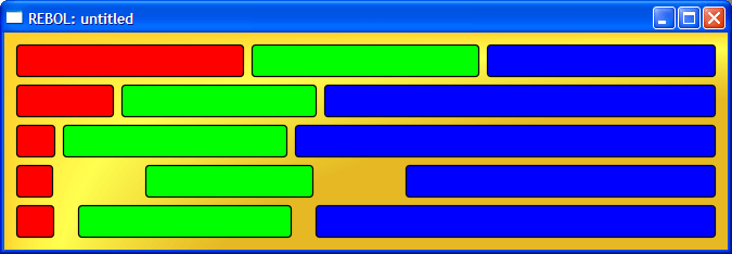
Here are some features to observe:
- The first group of boxes all expand by an equal amount.
- The second group expands the green box at twice the amount of the red box, and the blue box at four times that amount. Also note that if you expand the window large enough, each of the boxes will stop expanding at their max-size values. (You will not see that effect if the window is too small.)
- The third group shows a more extreme example, where the green and blue boxes are expanded by a lot more than the red box. The red box has only expanded by a small amount (if at all).
- The fourth group adds some pad faces between the boxes. Notice that by default, the pads add substantial space.
- The fifth group uses the pada style which limits the max-size. Notice that the pad spaces are much smaller.
Linking Related Faces
Within a GUI there are times when you need to link or attach one face to another. Change to one of the faces affects the other. For example, a scroll bar may cause a text panel to scroll its contents.
There are two methods of relating faces: named relations and proximity relations. They are explained below.
Named Relations
You can give a name to a face and that name can be used from other faces to perform specific actions.
For example:
prog: progress
slider attach 'prog
Here attach is a reactor that "connects" the slider value to the progress bar. The prog face name is used to do that, and be sure to note that the name must be a literal word where it is referenced.
It should be noted that all names are scoped to their primary panel, so you can refer to a name from other panels within the primary panel.
For example, this still works, even though the prog name is used from a different panel:
prog: progress
panel [
    text "Move this slider:"
    slider attach 'prog
]
Note: the names facet of a parent controls the scope of names.
Proximity Relations
Some faces can automatically attach themselves to other faces that are nearby.
For example, a scroller will attach itself automatically to any prior face that includes an on-scroll actor. This feature makes it easy to attach scroll bars to text areas and panels without requiring names.
Here is an example:
group [
    text-area (read-string %file.txt)
    scroller
]
This works the same way as if you wrote:
group [
    ta: text-area (read-string %file.txt)
    scroller attach 'ta
]
Transition Effects
Animated transition effects can be used to switch from one panel to another. The effects are specified as an argument to the switch-panel function.
Currently, these effects are defined:
| Effect | Description |
|---|---|
| fly-right | fly on from left to right |
| fly-left | fly on from right to left |
| fly-up | fly on from bottom to top |
| fly-down | fly on from top to bottom |
Other Predefined Panels
add table
Defining Panel Styles
docs needed