How to Create and Use Text Fields
Revised: 12-Mar-2024
Original: 8-June-2001
Return to: REBOL How To
Contents
Creating Text Fields
Built-in Styles
Field
Area
Info
Custom Fields
Fonts
Colors
Focus Color
Edges
Images and Effects
Use Styles!
Using Text Fields
Getting Input from Fields
Using Action Values
Using Face Variables
Finding Fields By Style Name
Changing Fields
Clearing All Fields
Updating Fields
Setting the Focus
Hidden Fields
Predefined Request Fields
Request-Text
Request-Pass
Additional Documents
How to Run the Examples
To run any of the examples shown below, use a text editor to create a REBOL header such as:
REBOL [Title: "Example"]
Then simply cut the example text and paste it after this line. Save the text file and give it a name, such as example.r. Then run the file just as you would run any REBOL file.
Creating Text Fields
Similar to all other VID user interface styles, text fields are defined with LAYOUT and displayed with the VIEW function.
Built-in Styles
There are three predefined text field styles:
| field | Used for single line input. The return and tab keys will terminate text entry and advance to the next field. |
| area | Used for multiline input of paragraphs or single lines. Text can be wrapped or not. |
| info | Used for displaying non-editable text. |
These styles all use the same face attributes to specify how they appear and operate.
Field
Here's how to create a few basic fields. These examples just display the fields. Later you will see how to obtain the input text from fields or modify their contents.
Here's a basic one line program that displays a text input field:
view layout [field]
When executed, it will display:
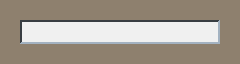
All of the attributes of the field are predefined, including the color, edge, and size. By default the size is 200x24.
See the REBOL/View documentation for descriptions of the VIEW and LAYOUT functions.
For the remaining examples, the VIEW and LAYOUT functions are not shown, but all of these examples are functional and can be run by placing them within a block as shown below:
view layout [
    (example)
]
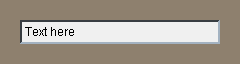
To display default text in a field, supply the text as a string after the FIELD style:
field "Text here"
This appears as:
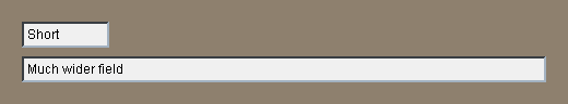
The pixel widths of fields can be specified:
field 80 "Short"
field 480 "Much wider field"
which result in:
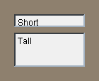
Both the width and height of fields can be specified with a pair:
field 100x18 "Short"
field 100x48 "Tall"
This displays as:
Here is an example input form that uses three fields and provides labels for the fields:
style lab label right 60x24
across
lab "Name:" field return
lab "Email:" field return
lab "Phone:" field return
lab
space 0
button "Enter"
button "Cancel"
Note that the empty LAB line is a simple technique to force the buttons to be indented by the same amount as the fields.
The result is:
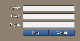
As you type into the fields, pressing a tab or a return will hop to the next field. Pressing a CTRL-tab will hop back to a prior field.
In a later section you will see how to grab the contents of these fields.
Area
Areas are similar to fields but are designed for text paragraphs that require multiple lines.
Here is the default area style:
view layout [area]
This displays a large empty text input box:
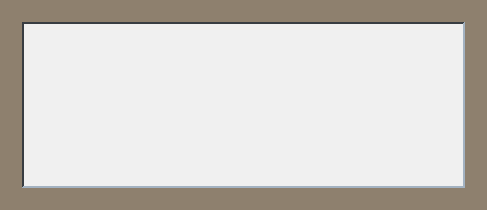
The default size for an area is 400x150, as shown above.
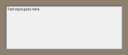
To provide default text input for an area, you can write:
area "Text input goes here."
This will appear as:
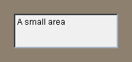
You can specify the size of the area with a pair such as:
area 150x50 "A small area"
This area would appear as:
The text of an area can come from any source. For instance, you can read a file and display its text in an area:
area 400x400 read %fields.txt
This produces a large area that shows the text source to this document.
In a similar fashion you can read a URL, such as the source to a web page or an online text document, by putting the URL in place of the file name above. Try it, but be sure to remove the % for URLs.
area 400x400 read http://data.rebol.com
If the area is to narrow for the next, by default the text does not wrap. To force text to wrap, you can use the WRAP attribute:
area 200x400 wrap read %fields.txt
This results in:
The opposite of WRAP is AS-IS, which is the default.
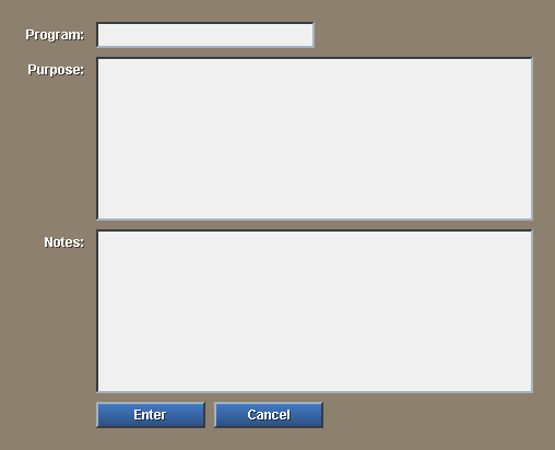
Here is an example input form that uses fields and areas:
style lab label right 60x24
across
lab "Program:" field return
lab "Purpose:" area return
lab "Notes:" area return
lab
button "Enter"
button "Cancel"
The result is:
In a later section you will see how to grab the contents of these fields.
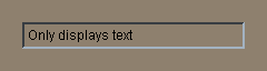
Info
The info style is similar to a field, but does not allow text editing. It is used for displaying static fields for information purposes only. The example:
info "Only displays text"
will display
It can be sized in the same way as the field examples above.
Custom Fields
All of the attributes that apply to other types of view faces also apply to fields. You can change their fonts, the color of their text or their background, change their edges, use special effects, etc.
Keep in mind that even though the fields appear different, all custom fields are editable in the same way as any other text field.
Fonts
The standard face font settings can be applied to fields.
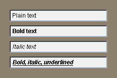
You can change the font style with:
field "Plain text"
field "Bold text" bold
field "Italic text" italic
field "Bold, italic, underlined" bold italic underline
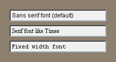
Or, change the font itself:
field "Sans serif font (default)" font-name font-sans-serif
field "Serif font like Times" font-name font-serif
field "Fixed width font" font-name font-fixed
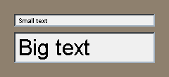
Any size font can be used within a field.
field 200x18 "Small text" font-size 9
field 200x44 "Big text" font-size 32
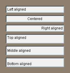
And, the field can be aligned in various ways:
field "Left aligned" left
field "Centered" center
field "Right aligned" right

field 200x32 "Top aligned" top
field 200x32 "Middle aligned" middle
field 200x32 "Bottom aligned" bottom
Colors
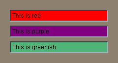
The color of the field area behind the font can be changed. This is the same rule as used for buttons, not the rule used for text. Just provide a color:
field "This is red" red
field "This is purple" purple
field "This is greenish" 80.180.120
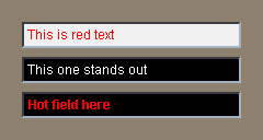
To change the text color itself, you must change the font color setting, as in:
field "This is red text" font-color red
field "This one stands out" black font-color white
field "Hot field here" bold black font-color red
To completely eliminate the color of the field area:
field "No backdrop area" colors none
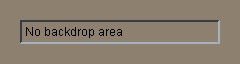
But, don't mix this up with an INFO style. This style can still be edited.
Focus Color
The focus color is the color of the box area when it is currently selected. The default is yellow. You can override that default by defining the secondary color of the face. For example:
field "No highlight color" colors [240.240.240 240.240.240]
will produce a field:
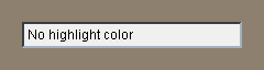
that will not turn yellow when you click on it.
Note that the colors must be specified as tuples. The block is not evaluated, so if color variables (e.g. white, red) are used, you must reduce the block first:
field "Light blue highlight color" colors reduce [white sky]
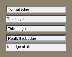
Edges
You can change the size, color, and effect of the surrounding field edges.
For example, here are a few edge size variations:
field "Normal edge"
field "Thin edge" edge [size: 1x1]
field "Thick edge" edge [size: 3x3]
field "Really thick edge" edge [size: 4x4]
field "No edge at all" edge none
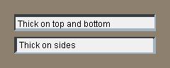
The edges can be uneven in their dimensions:
field "Thick on top and bottom" edge [size: 2x4]
field "Thick on sides" edge [size: 4x2]
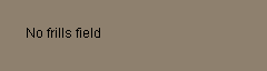
Sometimes you need to create a field that has no edges or background:
field "No frills field" colors none edge none
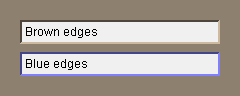
Edge color can be changed with:
field "Brown edges" edge [color: rebolor]
field "Blue edges" edge [color: 100.100.200]
And, the edge effect can be modified with:
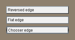
field "Reversed edge" edge [effect: 'bevel]
field "Flat edge" edge [effect: none]
field "Chooser edge" edge [size: 3x3 effect: 'bezel]
Images and Effects
Like any other VID face, images can appear behind a field's text. However, this can make text:
- Difficult to read.
- Slower to input.
- Odd to users.
So, do it only if necessary, such as when you have a theme to your interface and really want to accentuate it.
Here is a field that has an image:
field "Text field with NYC" %nyc.jpg
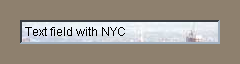
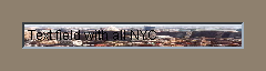
Note that you only see the top of the image. To see the entire image you will need a FIT effect:
field "Text field with all NYC" %nyc.jpg effect [fit]
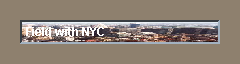
Of course, now you cannot read the text. So, change the text's color:
field "Field with NYC" bold font-color white %nyc.jpg effect [fit]
Still, this is not very usable. Perhaps try washing out the image:
field "Field with washed NYC" bold %nyc.jpg effect [fit luma 120]
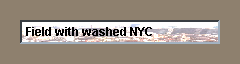
Now that's better. NYC just needed to be washed.
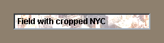
To use only part of NYC, use the CROP effect rather than FIT:
field "Field with cropped NYC" bold %nyc.jpg
    effect [crop 10x200 300x24 luma 120]
The above fields might be slow to type into, because the effect is computed with every keystroke. To avoid that, preprocess the image first:
img: to-image layout [origin 0  image %nyc.jpg effect [luma 120]]
view layout [field "Washed NYC" bold img effect [fit]]
Don't forget the FIT effect.
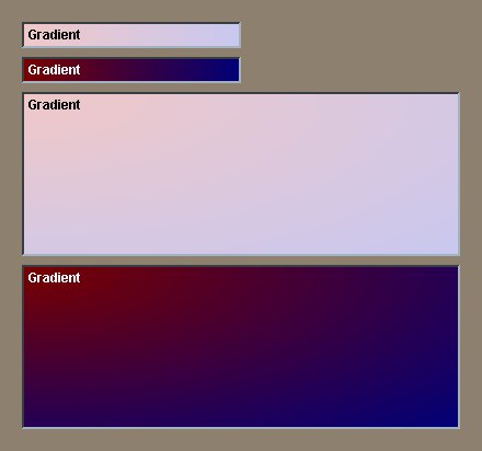
All of the other effects found in REBOL can be used for fields. For instance to put a gradient behind the text:
field "Gradient" bold effect [gradient 240.200.200 200.200.240]
field "Gradient" bold effect [gradient 120.0.0 0.0.120]
    font-color white

area "Gradient" bold effect [gradient 1x1 240.200.200 200.200.240]
area "Gradient" bold effect [gradient 1x1 120.0.0 0.0.120]
    font-color white
If keyboard input is slow, use the same precomputed effect technique as used with the image above.
Finally, to produce a dropshadow type of effect:
field "Dropshadow text" bold font-color white
    colors [0.120.120 120.120.0] shadow 2x2

Use Styles!
The above examples show how to make changes to the appearance of fields. If you have more than one field that has a different look, use a style to define it, rather than write it out each time.
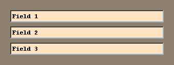
For instance, if you have more than one field with the same attributes, DO NOT write:
field "Field 1" 300 bold beige font-name font-fixed
field "Field 2" 300 bold beige font-name font-fixed
field "Field 3" 300 bold beige font-name font-fixed
Instead, write it as:
style fld field 300 bold beige font-name font-fixed

fld "Field 1"
fld "Field 2"
fld "Field 3"
You will thank yourself later when you need to make changes to the attributes. You only need to change one line.
Using Text Fields
Now that you know how to create fields, you're going to want to know how to use them. That's the topic of this section.
Getting Input from Fields
A field is for accepting text input from the user. So, how does your program get that input? There are a few methods, depending on your needs.
Using Action Values
As with buttons and other faces, you can provide an action block that executes when the text has been entered.
The example below will print the contents of a field after it has been entered:
field [print value]
Within the face action, the word VALUE holds the string of the input field. That's a special case, so see the View manual if you need more information about how it works.
You can do just about any processing you want within the action. For example, this line accepts a URL to browse:
across
label "URL:"
field [browse to-url value]
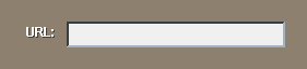
For web paegs, don't forget to type the HTTP:// part of the URL. You could check for it within the block and add it if necessary.
field [
    if not find/match value "http://" [insert value "http://"]
    show face
    browse to-url value
]
This example will insert the HTTP:// if it is missing. The field will be refreshed to show that it has been added. More on SHOW later.
Using Face Variables
The most common method of handling field input is to use a variable to refer to the field. To do so, put the variable name immediately before the field name:
a-fld: field
Now the value of the field face can be referred to by name.
Note: Try not to use a variable name that is the same as a style or attribute word, or that could lead to confusion later. For instance, don't call the variable "field".
In your code you can now write:
print a-fld/text
to print the contents of the field. The /text refinement accesses the text string of the field.
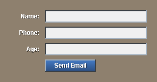
Here is an example that accepts three fields and sends them in an email message to someone:
style lab label right 60x24
across
lab "Name:"  f-name:  field return
lab "Phone:" f-phone: field return
lab "Age:"   f-age:   field return
lab
button "Send Email" [
    send fred@example.com reform [
        "name:"  f-name/text  newline
        "phone:" f-phone/text newline
        "age:"   f-age/text   newline
    ]
]
This example displays as:
Finding Fields By Style Name
There is one other technique that can be used to access the fields of a layout. You can access them by their style names.
For example, if you write:
out: layout [
    style lab label right 60x24
    across
    lab "Name:"  field return
    lab "Phone:" field return
    lab "Age:"   field return
]
You can print all of the fields with:
foreach face out/pane [
    if face/style = 'field [print face/text]
]
This scans the entire layout for all fields and prints them.
Changing Fields
To set the contents of a field, you can access its /text refinement in the same way as used above to get the value of the field.
For example:
f-name: field
across space 0
button "Set to Ann" [
    f-name/text: copy "Ann"
    show f-name
]
button "Set to Bob" [
    f-name/text: copy "Bob"
    show f-name
]
Note that the COPY function must be used for the text, otherwise the literal string will be modified as the user modifies the field.
The example displays like this:
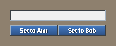
When you press on the buttons, the field will change appropriately.
Notice that the SHOW must be done to update the field in the window. The most common mistake when changing fields is to forget to update the fields with SHOW.
Here's another example:
text-list "Red" "Forest" "Blue" "Gold" "Teal" [
    f-color/text: copy value
    f-color/font/color: get load value
    show f-color
]
f-color: field "Pick a color"
The layout will look like:
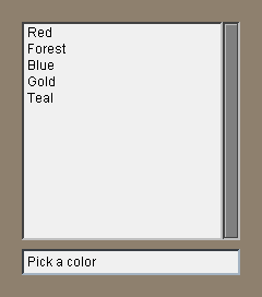
When you click on one of the colors, the text and the color of the text will be set in the field.
Clearing All Fields
There are times when you need clear all of the fields of a layout to allow the user to enter fresh input. This can be done with the CLEAR-FIELDS function.
Provide the CLEAR-FIELDS function with the layout face. For example:
view out: layout [
    style lab label right 60x24
    across
    lab "Name:"  field return
    lab "Phone:" field return
    lab "Age:"   field return
    lab space 0
    button "Clear" [clear-fields out  show out]
    button "Enter"
]
The name of this layout is OUT. When the user clicks on the Clear button, all of the fields will be cleared.
Updating Fields
When you modify fields that contain more than 200 characters, you will need to provide additional information to force the entire face to update.
Every text face contains an internal block of lines that allow it to optimize the display of the text. When the text is changed, the line-list face variable should be set to NONE to force all of the text in the face to be recomputed. If you don't do this, you may see text garbage in the field.
Here is an example:
f-data: area 400x400 read %fields.txt
button "Clear" [
    clear f-data/text
    f-data/line-list: none
    show f-data
]
This shows a large text face. Pressing the Clear button clears the /text string, and the line-list is reset to NONE to indicate that all the text has been affected.
Setting the Focus
The field face that is receiving the keyboard input is called the focal face. It is the input focus.
The focus is normally set by the user when a field is selected with the mouse. However, the FOCUS and UNFOCUS functions can be used to set and remove the focus within a program.
The FOCUS function is called with the field face that needs the focus. For example:
out: layout [
    f1: field "field 1"
    f2: field "field 2"
]
focus f1
view out
will set the focus to the first field when the layout is displayed.
This example could be extended to provide buttons to show how the focus can be moved:
view layout [
    across
    f1: field "field 1"
    button "Focus 1" [focus f1]
    return
    f2: field "field 2"
    button "Focus 2" [focus f2]
    return
    button "No Focus" [unfocus]
]
It displays as:
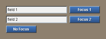
Clicking on the first two buttons will change the focus. Clicking on the third button will remove the focus entirely.
If your interface includes multiple layouts, it is a good idea to clear the focus before changing the layout. This can be done with the UNFOCUS function. It requires no arguments.
unfocus
Hidden Fields
For some types of fields, such as a password entry, you may not want to display the text that is being input. Any field can be set to hidden input by supplying the HIDE word. For example:
f-pass: field hide
will show a "" for each character within it.
Note that access to the text in this field is different too. F-pass/text will be the "" string that is being displayed. The f-pass/data field contains the actual text. To print the contents of the field above use:
print f-pass/data
The following is an example for entering a username and password. The password is hidden.
view layout [
    style lab label right 60x24
    across
    lab "User:" f1: field return
    lab "Pass:" f2: field hide return
    lab
    button "Enter" [
        print [f1/text f2/data]
    ]
]
It displays as:
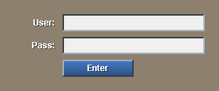
Note that there is a predefined pop-up request for this. See below.
Predefined Request Fields
On occasion you may need to request a string from the user. There are two predefined request functions that can help.
Request-Text
This function allows you to request a string from the user. It will pop-up a window to accept the input.
It can be used as simply as:
print request-text
You can also provide a /title refinement to ask a question:
print request-text/title "What is your name?"
In addition, you can also provide a default response:
print request-text/title/default "What is your name?" "bob"
If the user presses CANCEL a NONE value is returned.
Request-Pass
To request a username and password, there is a predefined function called REQUEST-PASS. It will pop-up a window.
The function will return a block that contains the username and password strings. For example:
probe request-pass
To set the result to variables, you can write:
set [user pass] request-pass
To change the title of the request:
request-pass/title "Enter your account:"
To provide a default user name:
request-pass/user "Bob"
To request only a password and no username:
request-pass/only
If the user presses CANCEL a NONE value is returned.
Additional Documents
Additional How-To documents will be provided to describe scrolling, resizing, and how to control tab and return behaviors.