A Beginner's Guide to REBOL Visual Interfaces (VID)
Revised: 1-Apr-2010
Original: 5-April-2001
With REBOL/View it's easy and quick to create your own user interfaces. The purpose of this tutorial is to teach you the basic concepts or REBOL/View interfaces in about 20 minutes.
Introduction to VID
VID is REBOL's Visual Interface Dialect. A dialect is an extension of the REBOL language that makes it easier to express or describe information, actions, or interfaces. VID is a dialect that provides a powerful method of describing user interfaces.
VID is simple to learn and provides a smooth learning curve from basic user interfaces to sophisticated distributed computing applications.
Creating VID Interfaces
VID interfaces are written in plain text. You can use any text editor to create and edit your VID script. Save your script as a text file, and run it with REBOL/View.
Interactive Version Available
This tutorial is also available as an interactive application that you can run in REBOL/View. Click on the Easy VID icon in the R2 Viewtop.
Older Graphics Examples - The images shown here were created in earlier versions of REBOL that had different default attributes (styles) and may not precisely match what you see in newer versions. However, the attributes you specify will produce the same results as shown here.
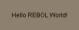
Minimal VID Example
Here is a minimal VID example. It creates a window that displays a short text message. Only one line of code is required:
view layout [text "Hello REBOL World!"]
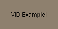
You can type this line at the REBOL console prompt, or save it in a text file and run it with REBOL. If you save it as a file, the script will also need a REBOL header. The header tells REBOL that the file contains a script. Here is an example of the script file with a header:
REBOL [Title: "Example VID Script"]

view layout [text "VID Example!"]
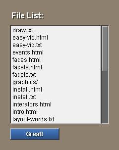
You can also add buttons and other gadgets to the script. The example below displays a text, list of files, and a button:
view layout [
    vh2 "File List:"
    text-list data read %.
    button "Great!"
]
Two Basic Functions
Two functions are used to create graphical user interfaces in REBOL: VIEW and LAYOUT.
The LAYOUT function creates a set of graphical objects. These objects are called faces. You describe faces with words and values that are put into a block and passed to the LAYOUT function.
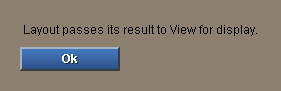
The VIEW function displays faces that were previously created by LAYOUT. The example below shows how the result of the LAYOUT function is passed to the VIEW function, and the interface is displayed.
view layout [
    text "Layout passes its result to View for display."
    button "Ok"
]
Styles
Styles describe faces. The examples above use the text and button styles to specify a text line and a button. REBOL has 40 predefined face styles. You can also create your own custom styles. Here are a few example styles:
view layout [
vh1 "Style Examples"
box brick 240x2
vtext bold "There are 40 styles built into REBOL."
button "Great"
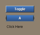
toggle "Press" "Down"
rotary "Click" "Several" "Times"
choice "Choose" "Multiple" "Items"
text-list 120x80 "this is" "a list" "of text"
across
check
radio radio
led
arrow
below
field "Text Entry"
]

The words like backdrop, banner, box, text, and button are styles.
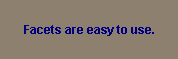
Facets
Facets let you modify a style. For instance, you can change the color, size, text, font, image, edge, background, special effects, and many other facets of a style.
Facets follow the style name. Here is an example that shows how you modify the text style to be bold and navy blue:
view layout [text bold navy "Facets are easy to use."]
The words bold and navy are not styles. They are facets that modify a style. Facets can appear in any order so you don't have to remember which goes first. For example, the line above could be written as:
view layout [text "Facets are easy to use." navy bold]

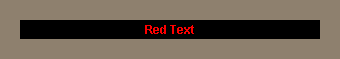
Many facets that can be specified. Here is an example that creates bold red text centered in a black box.
view layout [text 300 bold red black center "Red Text"]
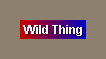
You can create facets that produce special effects, such as a gradient colored backdrop behind the text:
view layout [
    vtext bold "Wild Thing" effect [gradient 200.0.0 0.0.200]
]
Custom Styles
Custom styles are shortcuts that save time. When you define a custom style, the facets you need go into the new style. This reduces what you need to specify each time you use the style, and it allows you to modify the look of your interface by changing the style definitions.
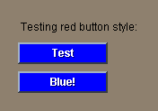
For example, here is a layout that defines a style for blue buttons. The style word defines the new style, followed by the old style name and its facets.
view layout [
    style btn button blue
    text "Testing red button style:"
    btn "Test"
    btn "Blue!"
]
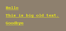
So, if you wanted to create a text style for big, bold, underlined, yellow, typewriter text:
view layout [
    style yell tt 220 bold underline yellow font-size 16
    yell "Hello"
    yell "This is big old text."
    yell "Goodbye"
]
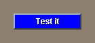
Note About Examples
From this point forward, all examples will assume that the view and layout functions are provided. Only the layout block contents will be shown. To use these examples in your scripts, you will need to put them in a layout block, as was shown earlier.
For example, code that is written as:
view layout [button blue "Test it"]

will now appear as:
button blue "Test it"
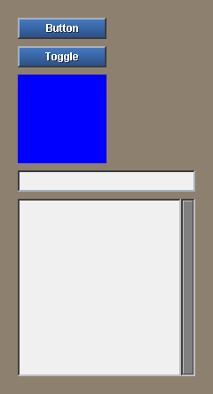
Face Sizes
The size of a face depends on its style. Most styles, such as buttons, toggles, boxes, checks, text-lists, and fields, have a convenient default size. Here are some examples.
button "Button"
toggle "Toggle"
box blue
field
text-list
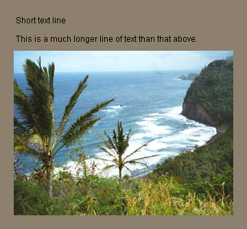
If no size is given, text will automatically compute its size, and images will use whatever their source size is:
text "Short text line"
text "This is a much longer line of text than that above."
image %palms.jpg
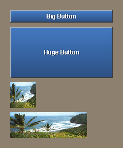
You can change the size of any face by providing a size facet. The size can be an integer or a pair. An integer specifies the width of the face. A pair specifies both width and height. Images will be stretched to fit the size.
button 200 "Big Button"
button 200x100 "Huge Button"
image %palms.jpg 50x50
image %palms.jpg 150x50
Color Facets
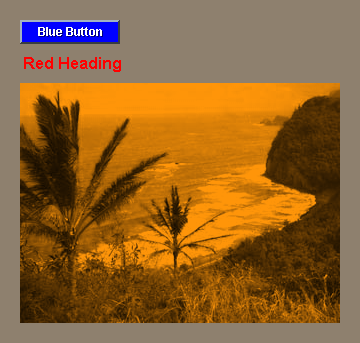
Most styles have a default color. For example the body of buttons will default to a teal color. To modify the color of a face, provide a color facet:
button blue "Blue Button"
h2 red "Red Heading"
image %palms.jpg orange
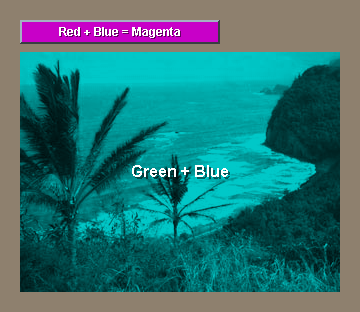
Colors can also be specified as tuples. Each tuple contains three numbers: the red, green, and blue components of the color. Each component can range from 0 to 255. For example:
button 200.0.200 "Red + Blue = Magenta" 200
image %palms.jpg 0.200.200 "Green + Blue"
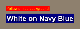
Some face styles also allow more than one color. The effect of the color depends on the style. For text styles the first color will be used for the text and the second color for the background of the text:
text "Yellow on red background" yellow red
banner "White on Navy Blue" white navy
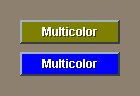
For other styles, the body of the face is the first color, and the second color will be used as its alternate.
button "Multicolor" olive red
toggle "Multicolor" blue orange
Text Facets
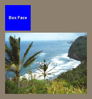
Most faces will accept text to be displayed. Even graphical faces can display text. For example, the box and image faces will display text if it is provided:
box blue "Box Face"
image %palms.jpg "Image Face"
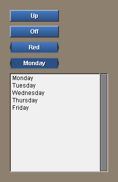
Most button faces will accept more than one text string. The strings will be shown as alternates as the face is selected.
button "Up" "Down"
toggle "Off" "On"
rotary "Red" "Green" "Blue" "Yellow"
choice "Monday" "Tuesday" "Wednesday" "Thursday" "Friday"
text-list "Monday" "Tuesday" "Wednesday" "Thursday" "Friday"
When other datatypes need to be displayed as text, use the form function to convert them first:
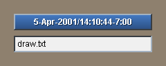
button 200 form now
field form first read %.
Document Text Style
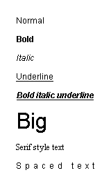
Document text is dark on light and can also include a number of facets to set the font, style, color, shadow, spacing, tabbing, and other attributes.
backcolor white
text "Normal"
text "Bold" bold
text "Italic" italic
text "Underline" underline
text "Bold italic underline" bold italic underline
text "Big" font-size 32
text "Serif style text" font-name font-serif
text "Spaced text" font [space: 5x0]
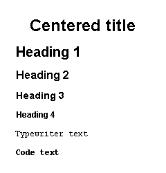
Document text also includes these predefined styles:
backcolor white
title "Centered title" 200
h1 "Heading 1"
h2 "Heading 2"
h3 "Heading 3"
h4 "Heading 4"
tt "Typewriter text"
code "Code text"
Video Text Style
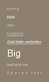
Video text is light on dark and can include a number of facets to set the font, style, color, shadow, spacing, tabbing, and other attributes.
vtext "Normal"
vtext "Bold" bold
vtext "Italic" italic
vtext "Underline" underline
vtext "Bold italic underline" bold italic underline
vtext "Big" font-size 32
vtext "Serif style text" font-name font-serif
vtext "Spaced text" font [space: 5x0]
Video text also includes these predefined styles:
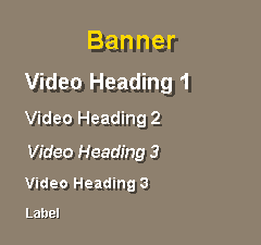
banner "Banner" 200
vh1 "Video Heading 1"
vh2 "Video Heading 2"
vh3 "Video Heading 3"
vh4 "Video Heading 3"
label "Label"
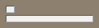
Text Entry Fields
Text input fields accept text until the enter or tab key is pressed. A text input field can be created with:
field
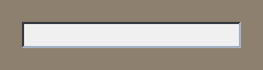
The field can contain text if it is provided:
field "This is the default."
To make the field larger or smaller, provide a width:
field 30
field 300
Fields will scroll when necessary.
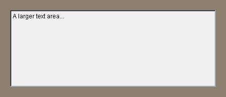
Larger amounts of text can be entered in an area. Areas also accept an enter key and will break lines.
area "A larger text area..."
You can also specify the area size:
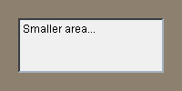
area 160x60 "Smaller area..."
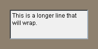
To force the text in an area to wrap rather than scroll horizontally, provide the wrap option:
area 160x60 wrap "This is a longer line that will wrap."
Text Lists
Text lists are easy to create. Here is an example.
text-list "Eureka" "Ukiah" "Mendocino"
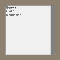
You can also provide it as a block:
text-list data ["Eureka" "Ukiah" "Mendocino"]

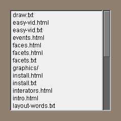
Almost any type of block can be provided. Here is a list of all the files in your current directory:
text-list data read %.
Here is a list of all the words REBOL has scanned:
text-list data first system/words
Images
By default an image will be scaled to fit within a face.
image 60x60 %palms.jpg
image %palms.jpg red
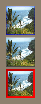
Images can be framed in a number of ways:
image 100x100 %palms.jpg frame blue
image 100x100 %palms.jpg bevel
image 100x100 %palms.jpg ibevel red 6x6
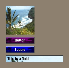
Most other faces can accept an image as well as text:
box 100x100 %palms.jpg
button "Button" %palms.jpg purple
toggle "Toggle" %palms.jpg blue red
field bold "This is a field." %palms.jpg effect [brighten 100]
The image can be provided as a filename, URL, or image data.
Backdrops
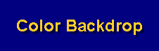
A backdrop can be a color, an effect, an image, or a combination of the three. For example a backdrop color would be written as:
backdrop navy
banner "Color Backdrop" gold
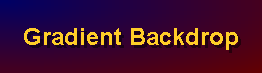
To create a backdrop effect provide it on the line:
backdrop effect [gradient 1x1 0.0.100 100.0.0]
banner "Gradient Backdrop" gold
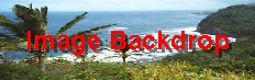
A backdrop image can be a file, URL, or image data:
backdrop %palms.jpg
banner "Image Backdrop" red
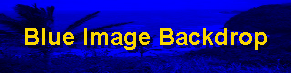
The backdrop image can be colorized:
backdrop %palms.jpg blue
banner "Blue Image Backdrop"
The image can include an effect:
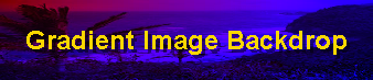
backdrop %palms.jpg effect [fit gradcol 1x1 100.0.0 0.0.250]
banner "Gradient Image Backdrop"
Effect Facets
A range of effects are supported for faces. All of these effects are performed directly on the face when it is rendered. Here are examples of a few possible effects:
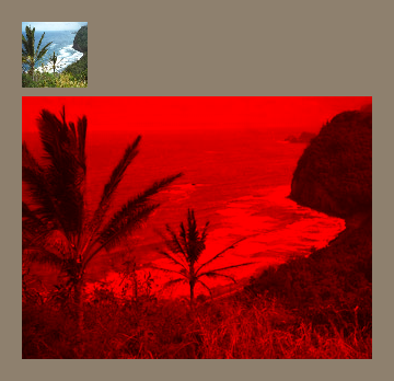
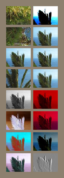
style palms image 80x60 %palms.jpg
palms effect [flip 1x1]
palms effect [rotate 90]
palms effect [reflect 1x1]
palms effect [crop 0x50 120x60 fit]
palms effect [grayscale]
palms effect [invert]
palms effect [difference 200.0.0]
palms effect [tint 80]
return
palms effect [contrast 50]
palms effect [brighten 50]
palms effect [sharpen]
palms effect [blur]
palms effect [colorize 200.0.0]
palms effect [gradcol 1x1 150.0.0 0.0.150]
palms effect [gradmul 0x1 0.100.0]
palms effect [grayscale emboss]
Effects can be used in combination to create other interesting results. However, keep in mind that the computations are performed in real time. If complex combinations are required, a temporary image should be created with the to-image function.
Actions
An action can be associated with almost any face. To do so, follow the face style with a block:
button "Test" [print "test"]
The block is used as the body of a function that is passed the face and the current value (if the face has one). For example:
toggle "Toggle" [print value]
rotary "A" "B" "C" [print value]
text "Click Here" [print face/text]
If a second block is provide, it is used for the alternate actions (right key):
button "Click Here" [print "action"] [print "alt-action"]
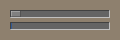
Use variables to modify the contents or state of other faces. For example, the slider will update the progress bar:
slider 200x16 [p1/data: value show p1]
p1: progress